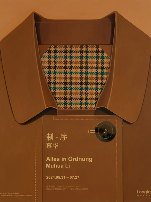
“制·序”将呈现第二期驻留艺术家(慕华)在Longlati经纬艺术中心为时一年的驻地成果,此次展览将以22件布面与木板作品作为驻留期间所构建的绘画语言的呈现。
「“很小的时候,我发现自己总会被带有规律与秩序感的事物吸引,譬如一块巧克力的排列格式、书籍内页中文字之间排序的方式、母亲衣服上的格子图纹、外公诊所里的中药格子墙、或是数学课上某一方程式里总结出的变化规律,又或是美术课上老师排列出的色彩卡片,在回忆里它们总是在某处以暧暧内含光的方式闪耀着。”」
——慕华
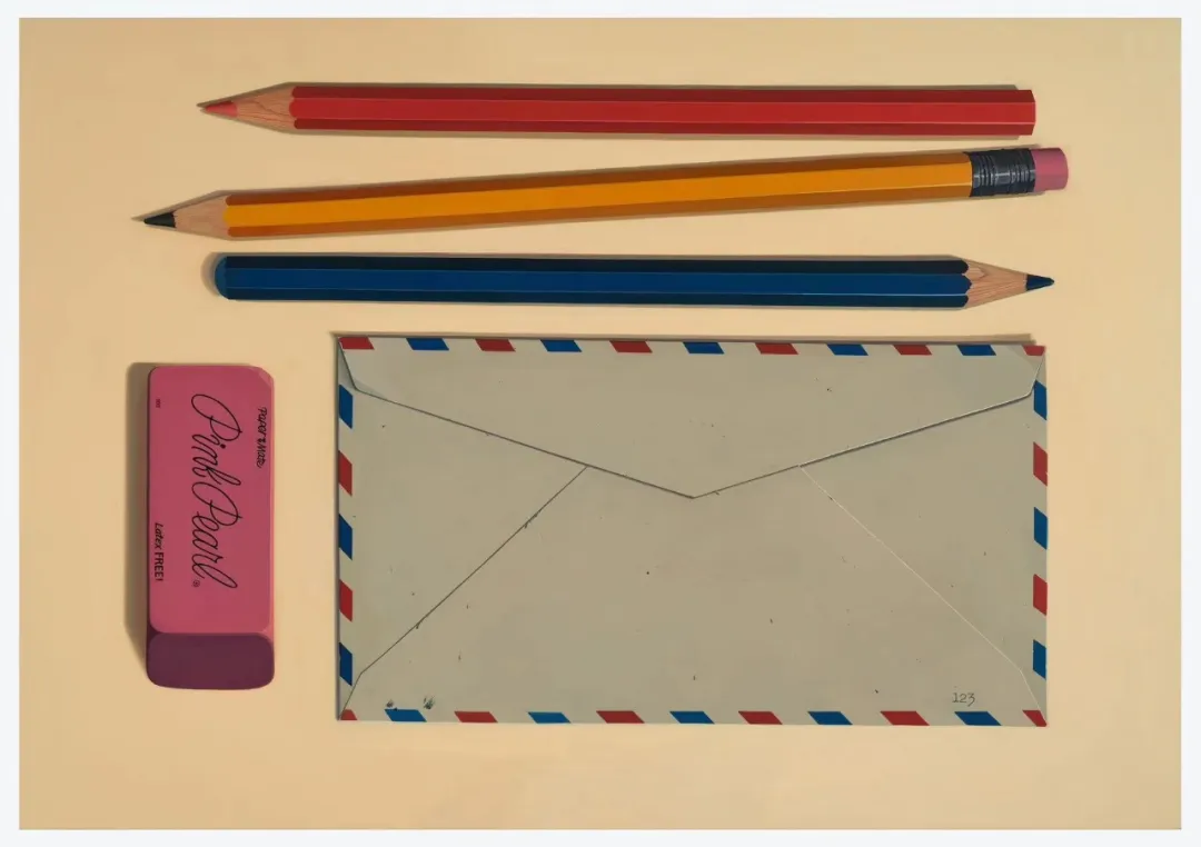
当下、过往,围绕在生活中的物质是画笔之下的主体,这些物件当中蕴藏着一种秩序感,在混沌与无序之中,艺术家试图在生活的日常之中寻找某种关于色彩、几何、形态的规律,在平衡、居中、理想化的画面构图中,不免联想到韦斯·安德森般的镜头语言。衬衫上的条纹、风衣的千鸟格内衬与铅笔排列的色彩的序列,这些元素无不与自身的成长的感知经验相关。相对于风衣与衬衫的平面化,雨伞中的布纹褶皱处理让人不禁联想到尼德兰北方文艺复兴时期的代表画家——杨凡艾克对布褶的描绘;色彩同样具有微妙深邃感,并且带有布褶的结构与硬度。
Muhua Li, Untitled, 2024, oil on canvas, 200 x 140 cm. 慕华,《无题》,2024年 ,布面油画 ,200 x 140厘米
成长记忆是一切的开始。文具系列除了作为记忆载体之外,更近一步着重于对抽象语言的探索,其中包含了色块、书法以及条码符号。铅笔《红 01》《橙 01》《黄 01》《绿 01》《蓝 01》对应的是物理光线折射之中人所分解出来的色彩序列,而铅笔尾部的命名,譬如:猩红、橘橙、拿坡里黄、黄绿、海洋蓝、这一系列命名则更为详细地分别出了在色系中对色彩的语言定义,而在被用文字指定为某一颜色的同时,也提出了逻辑与经验之间矛盾的关系;当一根铅笔处于某个特定的时间、环境、光线的影响之下,尽管在逻辑上可以指定它为某一个颜色,但从经验上来论述实则铅笔的每一面都具有不同的颜色。如维特根斯坦在《论颜色》中指出:“一种语言游戏;报道一个特定的物体是比另一个物体更亮还是更暗。不过,现在有一个相似的语言游戏:陈述一些特定色调的亮度关系。(这是要比较:确定两根棒的长度的关系,以及确定两个数字的关系)这两种语言游戏中的句子形式是相同的:X比Y更亮。但在第一种语言游戏中,说的是一种外在的联系,句子是时间性的,而在第二种语言游戏中,说的是一种内在的联系,句子是无时间性的。”
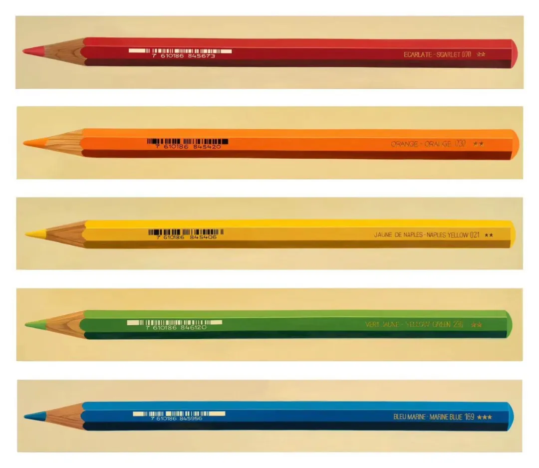
Muhua Li, from top to buttom: Red 01, Orange 01, Yellow 01, Green 01, Blue 01, 2024, oil on wood, each 140 x 20 cm. 慕华,从上至下:《红 01》、《 橙 01》、《黄 01》、《绿 01》、《蓝 01》,2024年,木板油画,每幅 140 x 20厘米
“我不是看见红的,而是看见杜鹃花是红的。”也让人联想到颜料中许许多多被命名的不同的红:印度红、橘红、威尼斯红、茜素红、酒红、朱红等等。这些都可以被称为红,但当把它们涂抹到同一张画布上时,所呈现的亮度、饱和度、冷暖等都不相同,又或制作它们原材料的产地不同,因此也命名不同。当讨论“红”时,每个人脑海中浮现的是不同的红,换而言之,只有相似或相近的“红”,而没有唯一且绝对的“红”。
另一位对色彩具有更为感性理解的诗人——歌德,他把色彩大体总结为“光与影”的关系;在他的《颜色理论》中如此形容黄色:“黄色是最接近光明的颜色,是一种最温暖的克制。它是白色逐渐衰退走向消沉之后,一丝柔和的黯然。”
无论是用逻辑或诗意的方式去形容色彩,恐怕都无法让所有人满意,这也更近一步指出语言的不可靠性与不确定性,于是不得不提到:“对于不可言说之物,必须保持沉默。”
将静默的日常之物,通过克制且内敛,甚至是略带洁癖般的方式被呈现于画面之上。此语境下,物质并非关于消费,平静的笔触也与韩炳哲所指的“平滑美学”不同;这里的物质是记忆的载体、从具象中提取抽象语言的寻索道途,而缓慢的笔触和温和的色彩,则是一种清理情绪、进入静处的方式。
(艺术家自述)
"Alles in Ordnung" will present the second residency artist, Muhua, showcasing the results of a one-year residency at Longlati. The exhibition will feature 22 pieces on canvas and wood panels, demonstrating the painting language developed during the residency.
「"From a very young age, I was drawn to things with a sense of order and regularity, such as the arrangement of a piece of chocolate, the way words are organized on the pages of a book, the plaid patterns on my mother’s clothes, the grid of herbal drawers in my grandfather’s clinic, the patterns derived from equations in math class, or the color cards arranged by the teacher in art class. In my memories, they always shine with a warm, subtle glow."」
——Muhua Li
The objects that surround us in our present and past lives serve as subjects for the artist's brush. These objects contain a sense of order, and amidst the chaos and disarray, the artist seeks patterns of color, geometry, and form in every day. The balanced, centered, and idealized compositions inevitably evoke the visual language of Wes Anderson's cinematography. The stripes on a shirt, the houndstooth lining of a trench coat, and the orderly arrangement of colored pencils are all elements tied to personal sensory experiences of growing up. Compared to the flatness of the trench coat and shirt, the fabric folds of an umbrella recall the depiction of drapery by the Northern Renaissance painter Jan van Eyck. The colors possess a similarly subtle and profound quality, embodying the structure and rigidity of the fabric folds.
Memories of growing up are the beginning of everything. Beyond serving as vessels of memory, the stationery series delves deeper into the exploration of abstract language, encompassing color blocks, calligraphy, and barcode symbols. The pencils "Red 01" "Orange 01," "Yellow 01," "Green 01," and "Blue 01" correspond to the spectrum of colors perceived by humans through the refraction of light. The names at the ends of the pencils, such as Scarlet, Orange, Naples Yellow, Yellow Green, and Marine Blue, offer a more detailed linguistic definition of colors within their respective color families. This naming process not only designates a specific color but also highlights the tension between logic and experience. While logically, a pencil can be assigned a specific color, experiential observation shows that each facet of the pencil exhibits different hues under varying conditions of time, environment, and light. As Wittgenstein notes in Remarks on Colour, "a language-game: Report whether a certain body is lighter or darker than another. -- But now there's a related one: State the relationship between the lightness of certain shades of color. (Compare with this: Determining the relationship between the lengths of two sticks--and the relationship between two numbers.). -- The form of the propositions in both language-games is the same: "X is lighter than Y". But in the first it is an external relation, and the proposition is temporal, in the second it is an internal relation, and the proposition is timeless."
Muhua Li, Untitled, 2023, oil on canvas, 32 x 22 cm. 慕华,《无题》,2023年, 布面油画 ,32 x 22厘米
"I perceive azaleas as the color red, rather than seeing the color red itself. " It also reminds us of the various shades of red that are named after pigments, such as Indian Red, Vermilion, Venetian Red, Alizarin Crimson, Burgundy, Scarlet, and more. While all these can be called red, their brightness, saturation, and warmth vary when applied to the same canvas. The different origins of the materials used to create them also contribute to their distinct names. When we discuss "red," the shade each person envisions is different. In other words, there exists only a relative or comparable notion of "red" rather than an exclusive and definitive concept of "red".
Goethe, a poet with a heightened appreciation for color, defined color as the interplay between "light and shadow." In his Theory of Colours, he describes yellow as, "Yellow is the color closest to light; it is a warm and restrained hue. It is the soft, gentle glow that remains as white gradually fades into darkness."
Whether describing color through logic or poetry, it is unlikely to satisfy everyone, further highlighting the unreliability and uncertainty of language, and so it is important to acknowledge that there are certain aspects that cannot be adequately expressed.
The canvas depicts daily objects in a subdued and introverted manner, with a hint of puritanical restraint. In this context, these objects are not about consumption, and the tranquil brushstrokes differ from Byung-Chul Han's concept of "smooth aesthetics." Here, the objects serve as vessels of memory and pathways for extracting abstract language from the tangible. The slow brushstrokes and gentle colors offer a way to clear emotions and enter a state of tranquility.
(Artist Statement)

慕华, 1995年出生于中国广东。
曾先后就读于中央美术学院附中,英国格拉斯哥艺术学院。现工作生活于北京、深圳。通过体察日常及记忆之物的微妙处,消除多余色彩和情绪,令绘画呈现出平静内敛的气息。基础的形体之间,色块明暗对应关系足以表达其感知体验。理性克制的绘画语言,又蕴藏着细腻持存的温度,两种矛盾的特性,赋予绘画以间离感,祛除物质自体被人为规训的表征,指向当下的“凝视与观看”本身。目前作品被Longlati基金会、和美术馆、知美术馆等机构及个人收藏。
Muhua Li was born in 1995 in Guangdong, China.
She has studied at the Affiliated High School of the Central Academy of Fine Arts and the Glasgow School of Art in the United Kingdom. Currently, she works and lives in Beijing and Shenzhen. By observing the subtleties of everyday objects and memories, she eliminates excess colors and emotions, allowing her paintings to exude a calm and introverted atmosphere. The relationships between basic forms and the correspondence of light and dark blocks are sufficient to express her perceptual experiences. Her rational and restrained painting language contains a delicate and enduring warmth. These two conflicting characteristics imbue the paintings with a sense of detachment, removing the representation of material entities being artificially trained. Instead, they point to the act of “gazing and viewing” itself in the present moment. Her works are collected by institutions and individuals included Longlati Foundation, HE Art Museum, and ZHI Art Museum.